Karla Cox
Inverell High School
EXPLORATION OF ABSTRACTION
Painting
Paint, beads, pens, oil pastels, spray
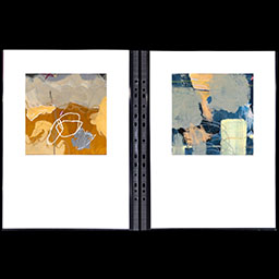
My body of work explores human experience through abstraction rather than reality. My application of mediums expresses our inner emotions and the intricacies of everyday life. Pushing the boundaries of my own expectations I developed a passion for different mediums and their application. There is a complex balance in the rhythmic arrangement of forms achieved by organic shapes and strokes. My experimentation with the colour palette throughout the work represents the ebb and flow of my Year 12: its highs and lows, excitement and disappointment. Texture adds an extra element and contrast in the juxtaposition of flat lines and vectors.
Marker's Commentary
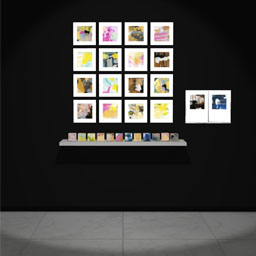
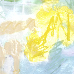
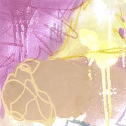
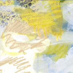
This substantial painting series is an exploration of pure abstraction. Twelve cardboard cubes, each facet presenting a different painted surface, have been arranged in association with sixteen colourful square paintings mounted in a grid arrangement. They sit alongside a folder with a collection of painted colour fields that are different but similar to the other paintings. An array of free-flowing shapes, blotches, drips and fine filigree lines sit in and over fields of colour. Sometimes looking like graphic meanderings, gestural slashes, scribbly bark markings or squiggles and scribbles, the colourful surfaces draw you in to examine the rhythms and diverse fields of mark making. Light, bright lolly smears and pours, textured frottage, spray paint, imbedded beads, pen lines and gestural brush strokes have been applied in opaque and translucent swathes of multicoloured hues. They convey a sense of excitement that is clearly intentional in impact. Colours, lines and drips press against each other with energetic force.
The sunny yellow, evocative of sun-drenched wattle; chocolate and ochre browns, alluding to rock faces and damp earth; lurid pinks representing ice blocks and the setting sun; and aqua, cobalt and ultramarine blues splashed with verdant green all evoke the borders of sea and land, while presenting both macro and micro, aerial and frontal views. In a homage to modernism, the grid is used as a formatting device but allows for an open-ended interpretation as if the shifting light induces the imagination to consider a never-ending number of possibilities for linking colour. It is an approach akin to the Abstract Expressionists; the accidental and explosive marks are united, demonstrating a knowledgeable understanding of colour relationships. Enticing and ever positive, this body of work emanates light and colour which stir on the surface creating shifting vibrations for both eye and mind.