June Philip
Wyndham College
FAIR AND LOVELY
Photomedia
Vinyl banner
Companies that create bleaching products feed into the generational trauma which haunts people of colour. Through targeted advertising, social media influencers and platforms, these destructive products are pitched as a solution cream to improve your life by altering the natural characteristics of melanin. This process rests on the idea that fairer skin is superior to dark, reinforcing deeply-seated societal hierarchies. My body of work examines the unjust values urging people to take extreme measures to fit narrow standards of beauty. Printing on a large-scale vinyl banner expresses the commercial properties of traditional public advertising. Fair is not the only lovely.
My artmaking practice has been influenced by the study and interpretation of the following artists: Barbara Kruger, Untitled (Your body is a battleground); Tracey Emin; Steve McCurry.
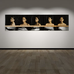
Marker's Commentary
Fair and Lovely is an exploration of contemporary standards of beauty and its impact on both individuals and society as a whole. Artfully displayed in the form of an expansive and commanding banner, this body of work exhibits a shrewd inclination towards the realm of advertising and towering billboards, initially encapsulating an alluring veneer reminiscent of polished photographic campaigns. The five colour portraits of the young women, however, do not exude the confident gaze normally seen in such advertising campaigns. Instead, the audience are confronted with the disconcerting gazes which seem more questioning, a subtle way for the audience to question what they are actually seeing, and implores them to delve deeper for meaning. The positioning of the models creates a rhythmic composition and the competent dramatic studio lighting techniques lead us away from the usual sleek brighter advertising imagery, indicating a more sinister meaning. The strategic placement of the textual band delineates the visible façade from the concealed veracity lurking beneath, forging a compelling dichotomy. The gradation of lighter skin tones to darker alludes to the choice of foundation colours and the notion of a flawless skin tone which enhances the intended meaning of skin colour and beauty, thereby intensifying the intended connotations surrounding beauty and racial aspects. Manifesting in the form of darkened skin concealed under coarse white paint, the thinner black and white close up photographs of eyes, hands and mouths below the text band are symbolic of what lies beneath, the truth of the matter being revealed. Overall, this body of work explores the theme of beauty and standards in a sophisticated manner, playing with the idea of glamorous advertising while subtly exposing the harm narrow standards of beauty can cause.